Glaucous-winged gull maps
Glorious gargantuan gulls going great distances
2023-05-26
Towards the end of my OPPTools contract for Environment & Climate Change Canada last year, I was asked to do a particularly fun little side project: make some maps! A few other members of the team were preparing a presentation for the public on their glaucous-winged gull (aka “GWGU”) research, and I was asked if I could put together a few maps for the presentation. I jumped at the opportunity because ever since seeing the post Beautiful and thematic maps with ggplot2 (only) I had long wanted to give the same beautiful map treatment to animal movement data.

Behold, the glorious glaucous-winged gull, staring you in the eye before screaming in your face. Image courtesy Wikimedia Commons.
Allow me to introduce you to the GWGU: the extremely sassy, infuriatingly smart megachonkers that look you straight in the eye and scream until you drop your fries at the Granville Island pier. In the springtime, once you notice the high pitched peee-eep, peeeep, peeeeep, motherpayattentiontoomeeeee, peeeeep sound of their chicks, you’ll suddenly find you’re hearing it everywhere. They are large, they are arguably in charge, and they are ubiquitous in the Vancouver area.
The data
Now, unfortunately, I’ve just finished hyping up the glaucous-winged gull for you, but the Movebank data is not released to the public at the time of this writing. No matter: Movebank is an amazing free online resource that houses data from hundreds of other scientists, and for the purposes of this tutorial, I’ve chosen a lovely little dataset of herring gulls in Belgium for this code demonstration instead.

The slightly smaller but no less interesting European herring gull, ready to poop on your face. Yet another gem courtesy Wikimedia Commons.
The code
Don’t you hate it when you’re trying to find a recipe and you have to scroll past the anti-vax mommy blogger retelling her sob story about how nana used to make these cookies every Thanksgiving and they’re just not the same without her touch but if you could please click the affiliate Amazon links to buy some spatulas that would maybe lessen the burn a little? I guess I’m doing the data science version of that to you, but with seagull content. I’m only slightly sorry. Here’s the code ‘recipe’ below! 🦃💻
Obligatory disclaimer: this code gets the job done but could always be improved!
Step 1: Download the dataset
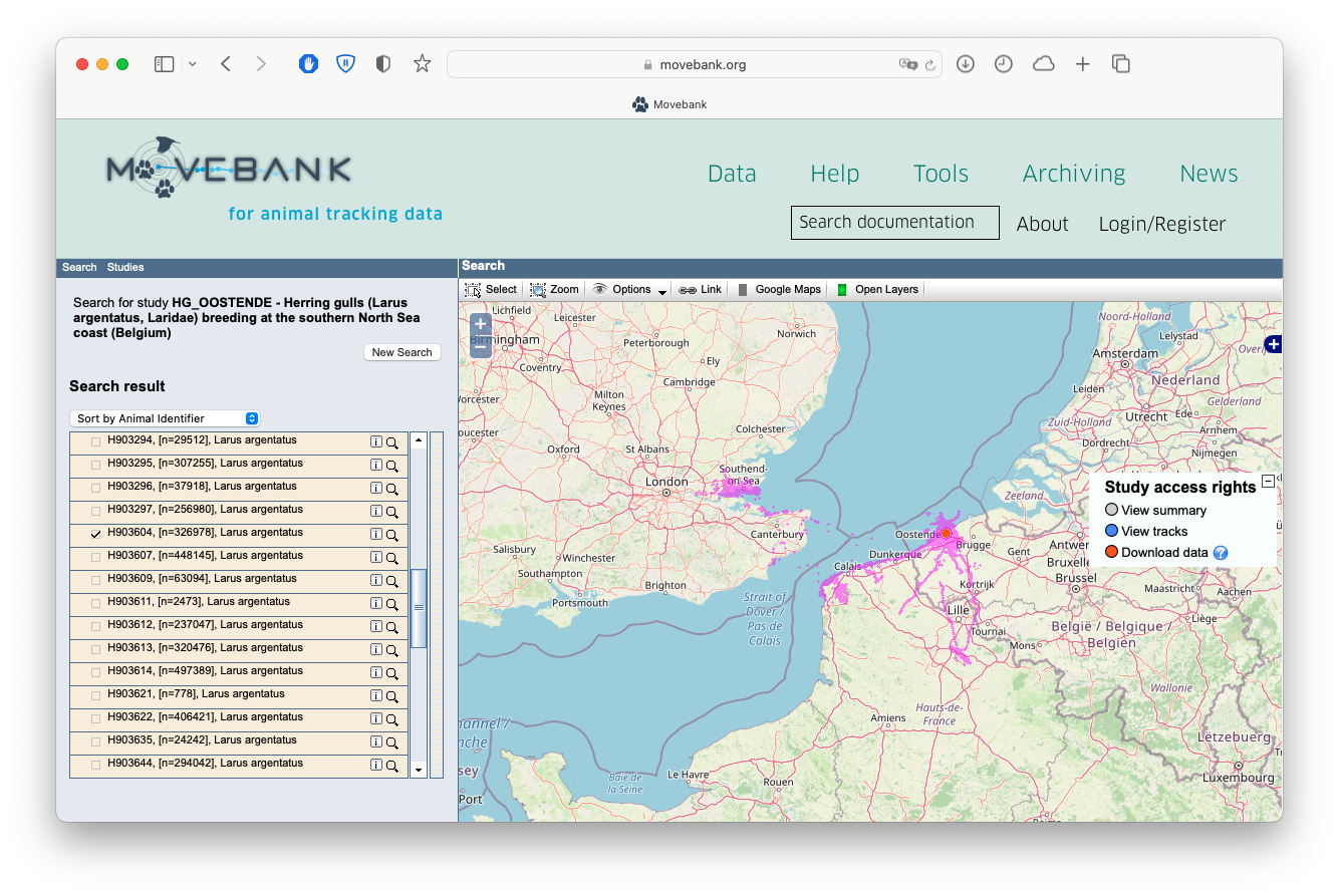
The first thing you’ll want to do is download the data off Movebank. To do so, you’ll need to first make an account on Movebank. Once that’s all set up you can carry on in R. You need to also have the Movebank ID handy for the particular study you want to download data from. You can either find that in the URL of the study page, or on the Study Details page:

Screenshot of the 'Study Details' page for a Movebank study, showing where you can find the Movebank ID.
We’re going to download study number 986040562, our herring gull data, using the {move} package. We also only want to download the track for just one bird - the dataset is far too large to download everything for a small tutorial. Movebank only has so many resources to pay the bills, so try to limit your download requests!
# Let's first download all the bird metadata for this study.
library(move)
birds <- getMovebank("individual", study_id = 986040562)
# We want to get the `id` for one particular bird with an
# interesting track: H903604.
id <- birds[["id"]][birds$local_identifier == "H903604"]
rm(birds)
# Now download the tracks for bird H903604. You will have
# to enter your login credentials again. This will take a
# minute or two.
tracks <- getMovebank("event",
study_id = 986040562,
individual_id = id)
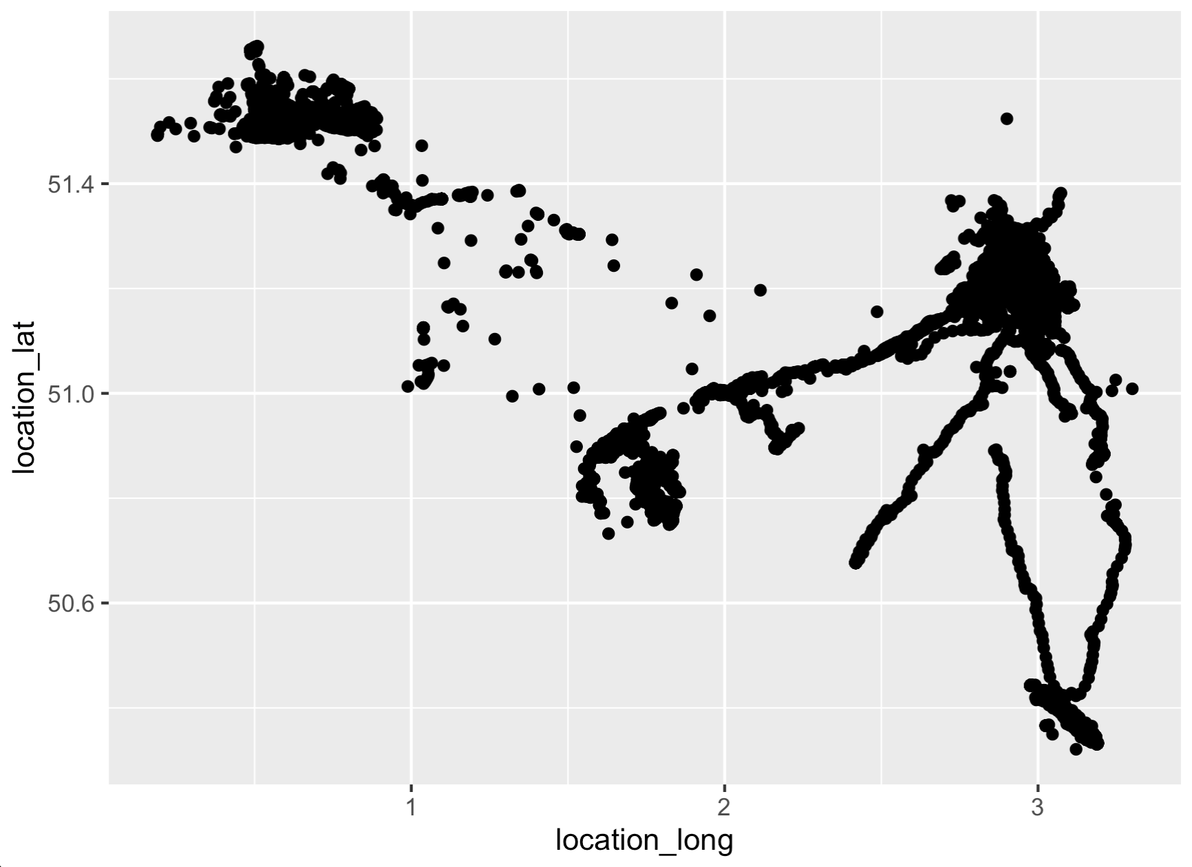
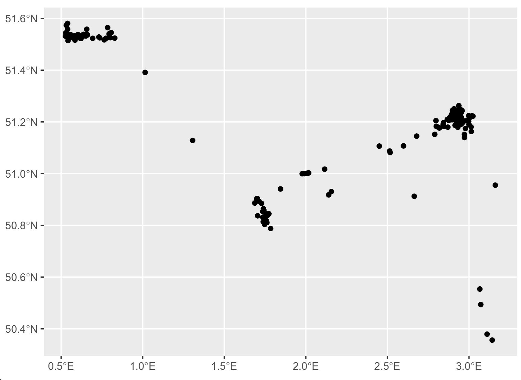
# Quickly visualize it to make sure it roughly matches
# the map we see online!
library(ggplot2)
ggplot(tracks,
aes(x = location_long,
y = location_lat)) +
geom_point()
Step 2: Trim down dataset & create sf object
For simple visualization, this is still a ridiculously large number of data points. This step is optional, but I prefer to thin out my datasets to a manageable number of points. Let’s aggregate to one point per day, and, for the sake of this example, cut it down to just 2 years of data. The code will run MUCH faster with ~500 rows, and this is meant to be a quick example after all!
And a fair warning here before we continue: this code as-is will not work with larger datasets. You’ll need to chop up larger datasets into chunks of ~500 or so records, run the code below, and then bind the results together at the end. I have linked to an example at the very bottom of this post.
# We need to first remove NA latitude/longitudes. Conveniently,
# this also thins out the large dataset considerably.
tracks <- tracks[!is.na(tracks$location_long), ] # remove NA lat/long records
tracks <- tracks[!is.na(tracks$location_lat), ]

# Clean up timestamps
tracks$timestamp <- lubridate::as_datetime(tracks$timestamp, tz = "CET")
tracks$date <- as.character(as.Date(tracks$timestamp))
tracks <- tracks[!is.na(tracks$timestamp), ] # drop any timestamps that failed to parse

# Calculate mean lat/long by date
# Also, we want to arrange the dataset by increasing date -
# we want to make sure the points are in the correct order
# before connecting the dots to make a linestring.
library(dplyr)
t <- tracks %>%
  group_by(date) %>%
  summarise(lat = mean(location_lat),
            lon = mean(location_long)) %>%
  mutate(date = as.POSIXct(date)) %>%
  filter(date < "2016-01-01") %>%
  arrange(date)

# Create sf object
library(sf)
t <- st_as_sf(t,
                   coords = c('lon', 'lat'),
                   crs = "+proj=longlat")
t <- st_transform(t, crs = 4326)

# Check it out
ggplot(data = t) + geom_sf()
Step 3: Convert points to linestring
# Now we can finally turn these thinned points
# into a linestring object!
l <- t %>%
  dplyr::arrange(date) %>%
  dplyr::summarize(do_union = FALSE, # this is KEY right here - we do not want to perform a GIS union operation.
                   .groups = 'drop') %>%
  sf::st_cast("LINESTRING")

# Check it out
ggplot(data = l) + geom_sf()
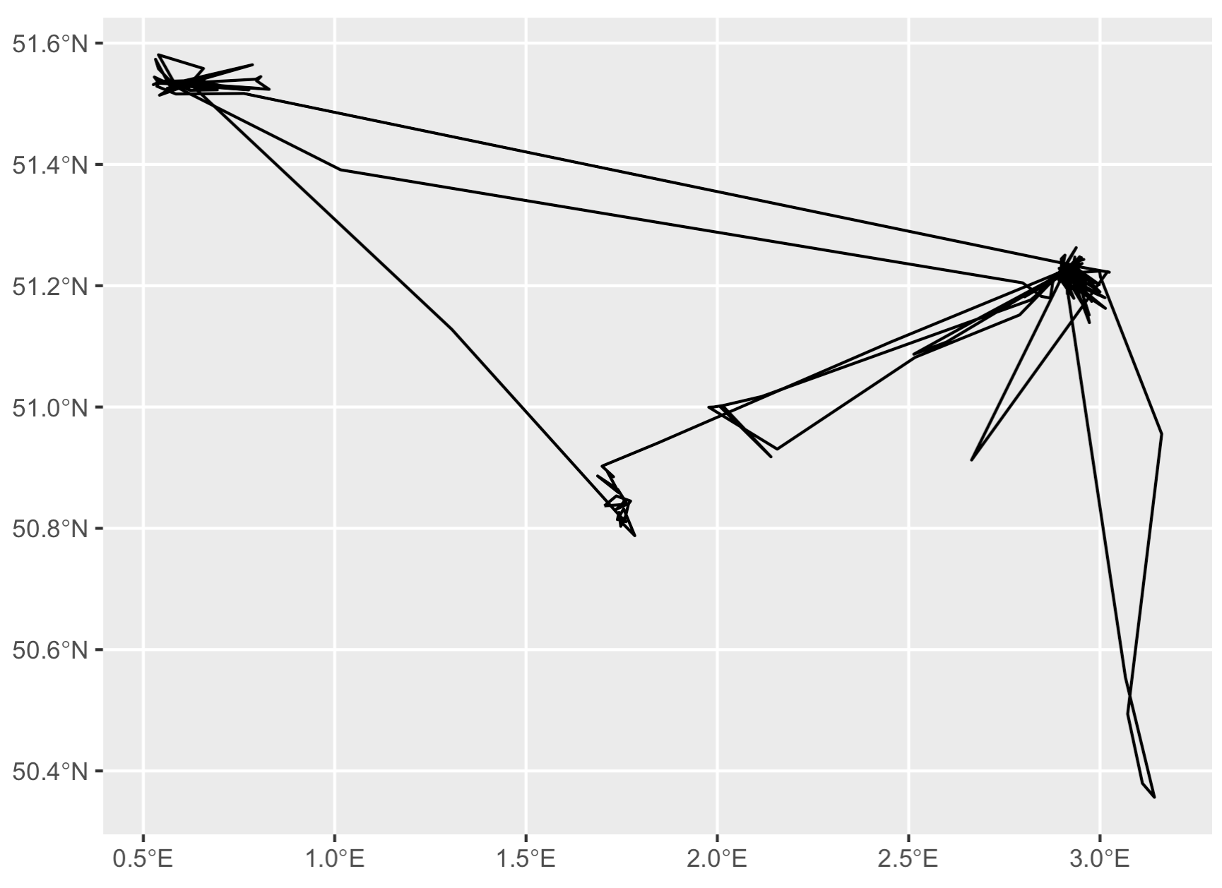
Now we’ve got a track line rather than disconnected dots. But, what if you want nice smooth curves in your tracks, like in the Movebank homepage animation? For that you need to interpolate between the existing points with a smoothing algorithm.

Nice smoothed curves between the individual GPS points of Movebank data, as visualized in the Movebank homepage animation. This is only achievable if you apply a smoothing algorithm to the data.
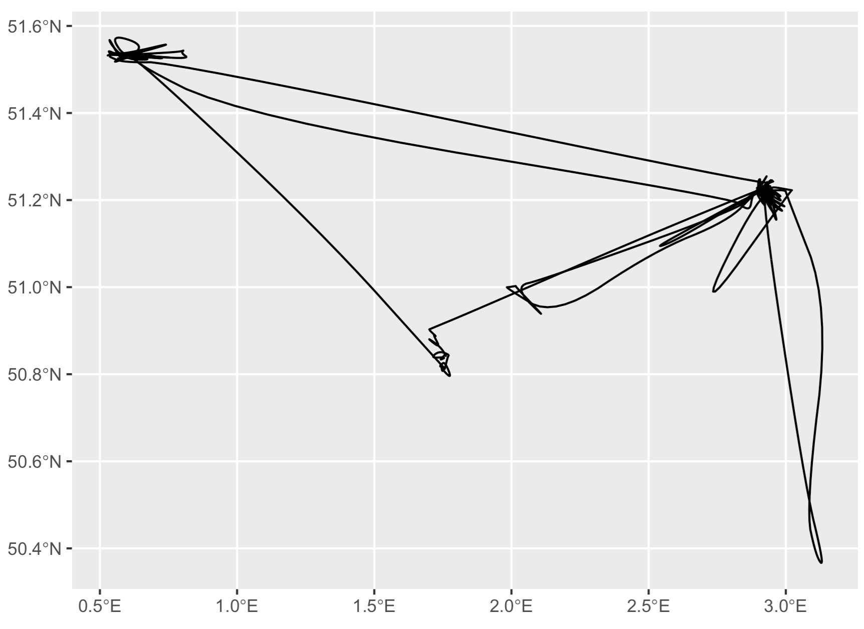
Step 4: Smooth out the lines
Now we have a great linestring, but it’s pretty ugly with all those pointy corners. Let’s smooth that out with the {smoothr} package. I just use the default ‘chaikin’ method, but there are many options available.
s <- smoothr::smooth(l, method = "chaikin")

# There are still some pointy angles, but it looks much
# nicer than the original data!
ggplot(data = s) + geom_sf()
Step 5: Merge smoothed data to original dataset
This is all fine and good if we just want to plot smoothed lines - but if we want to add a neat color gradient to the line, we need the timestamp to color the line.
Unfortunately here we hit a major snag: the smoothed data don’t contain any timestamps.. we need to merge this back to the original dataset to attach a timestamp to the smoothed data.
The solution has two parts:
- Extract the points from
sand merge totby the geographically nearest point. - Apply a few simple logic if/else statements to rearrange any wonky timestamps.
s_pts <- st_cast(s, "POINT")
s_pts$seq <- seq(nrow(s_pts)) # this is not necessary but useful for troubleshooting.
head(s_pts)
> Simple feature collection with 6 features and 1 field
> Geometry type: POINT
> Dimension:     XY
> Bounding box:  xmin: 2.92469 ymin: 51.22787 xmax: 2.930024 ymax: 51.23293
> Geodetic CRS:  WGS 84
> # A tibble: 6 × 2
>              geometry   seq
>           <POINT [°]> <int>
> 1 (2.930024 51.23293)     1
> 2 (2.927435 51.23036)     2
> 3 (2.926211 51.22918)     3
> 4  (2.92549 51.22851)     4
> 5 (2.924983 51.22807)     5
> 6  (2.92469 51.22787)     6
# Merge smoothed data to original data by nearest point.
# We'll call this "out", aka our eventual output.
out <- st_join(s_pts, t, join = st_nearest_feature)
Note you can immediately see here that the timestamps are all totally messed up. This is because sometimes points with completely different timestamps are geographically close enough they can still be merged. This brings us to the next step..
head(out)
> Simple feature collection with 6 features and 2 fields
> Geometry type: POINT
> Dimension:     XY
> Bounding box:  xmin: 2.92469 ymin: 51.22787 xmax: 2.930024 ymax: 51.23293
> Geodetic CRS:  WGS 84
> # A tibble: 6 × 3
>              geometry   seq date
>           <POINT [°]> <int> <dttm>
> 1 (2.930024 51.23293)     1 2014-05-23 00:00:00
> 2 (2.927435 51.23036)     2 2015-05-28 00:00:00
> 3 (2.926211 51.22918)     3 2015-03-21 00:00:00
> 4  (2.92549 51.22851)     4 2015-03-18 00:00:00
> 5 (2.924983 51.22807)     5 2015-03-18 00:00:00
> 6  (2.92469 51.22787)     6 2015-03-18 00:00:00
Step 6: Reorder the points to be in the correct order
As you can see, the smoothed data and the original data are merged, but the timestamps are absolutely out of whack. Compare the two visually and it’s immediately clear:
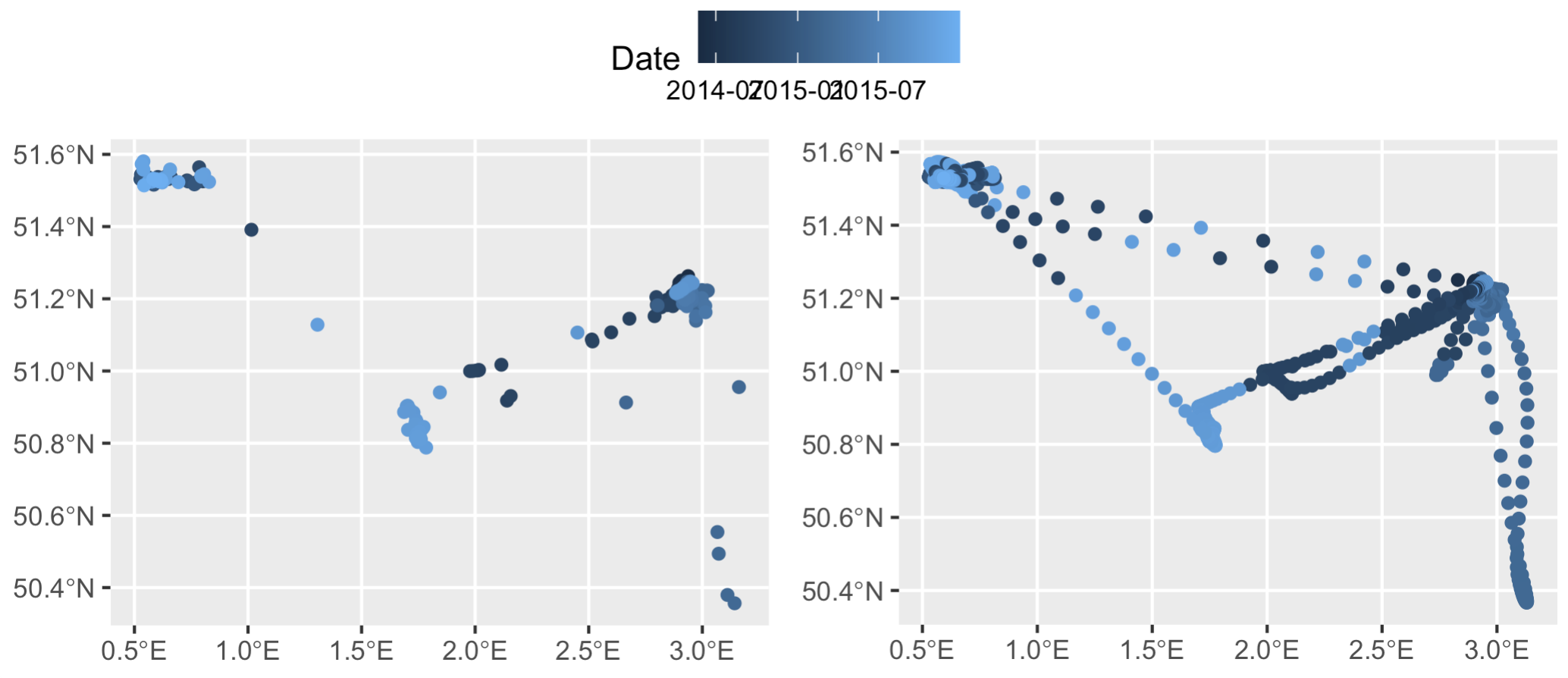
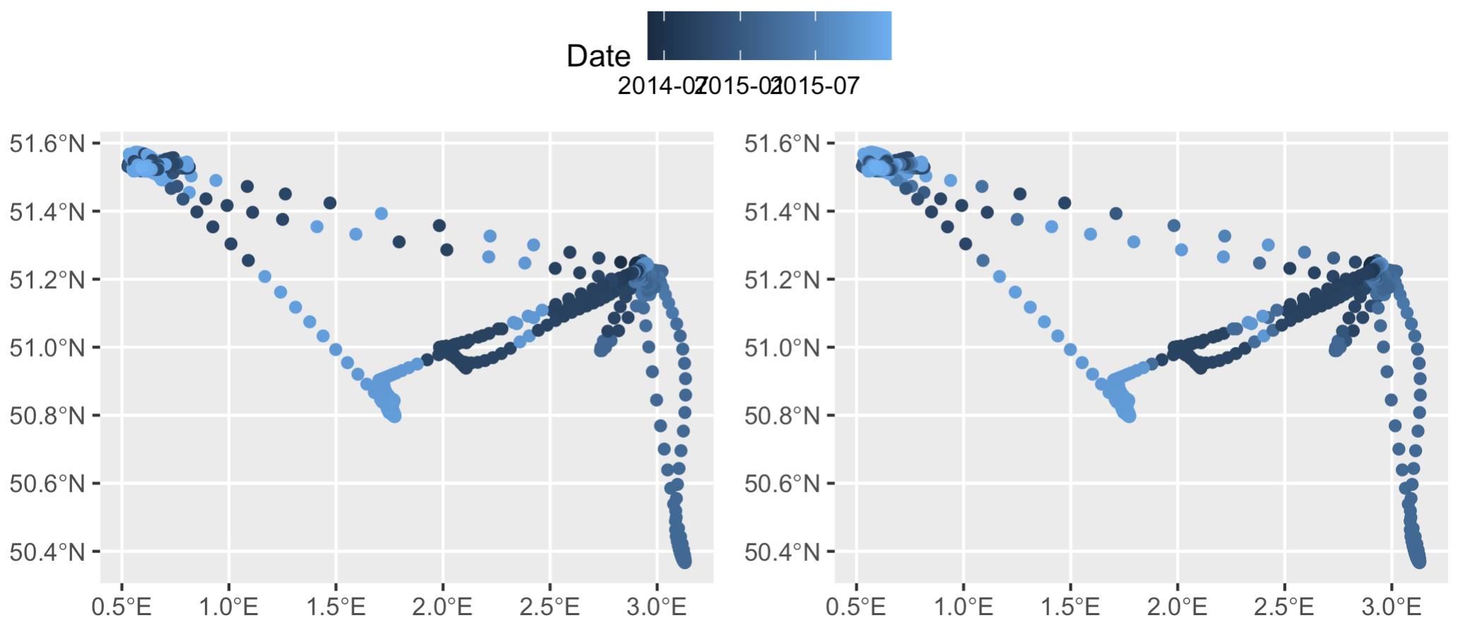
Left: the trimmed down dataset, `t`, colored by the 'date' column. Right: the smoothed out datapoints from `s` merged back with `t` based on geographic location. According to this visualization the bird is jumping around not only in space but also in time along a single flight path...
The key thing here is we know two timestamps with 100% accuracy: the first and the last. So, let’s set those manually to the first and last data points in out. (In this specific example the timestamps are correct, but there are often cases where they are not, so this is a crucial step. As an aside, this is also why doing this with datasets >500 records fails - there’s simply too many timestamps to try and rearrange.)
out[["date"]][1] <- min(t$date)
out[["date"]][nrow(out)] <- max(t$date)
Next, create the ‘difftime’ column - time difference between row n and n+1. Any negative difftimes = bad! Animals can’t be going backwards in time.
out$difftime <- difftime(out$date, dplyr::lag(out$date))
And also pull median time difference from original dataset. Any difftime > than the median time gap will be flagged (in addition to negative difftimes). Basically, if the interpolated timestamps jump over time gaps that are greater than what the tag itself transmits in the original data, that’s probably an interpolation error. The median timestamp lag in the original dataset will therefore serve as our upper limit or “max time difference” that we’ll allow in our interpolations. In larger datasets I will use the max time difference rather than median, but in this case, because our median time gap is already so large (24 hours), median is more appropriate.
max_diff <- median(difftime(t$date, dplyr::lag(t$date)), na.rm = T)
Now we are going to use this difftime and max_diff columns to figure out which timestamps are out of order or ok. The logic behind this is that if the difference between the current timestamp and the one right before it is >= 0, then it’s probably not out of order. If it’s negative, however, then it for sure is wrong. So, we’ll create the ’t_interp' column to keep track of this. I’m using the data.table::fcase function for this since it’s lightning fast compared to vanilla base ifelse or dplyr solutions - ideal for those huge telemetry datasets out there. Trust me, do not waste your time with a tidy solution here - it takes far too long to run.
The if/else logic is simple:
- If
difftime > max_diff, the result should be NA1 - If
difftime >= 0, use the timestamp in thedatecolumn - If
difftime is NA, use the timestamp in thedatecolumn
data.table::setDT(out)
out[ , t_interp := data.table::fcase( # create the 't_interp' column with the following if/else statements
  difftime > max_diff, as.POSIXct(NA, tz = "CET"), # change the timezone to whatever tz your data is in
  difftime >= 0, date,
  is.na(difftime), date
)]

head(out)
>                     geometry seq       date      difftime            t_interp
> 1: POINT (2.930024 51.23293)   1 2014-05-23       NA secs 2014-05-23 09:00:00
> 2: POINT (2.927435 51.23036)   2 2015-05-28 31968000 secs                <NA>
> 3: POINT (2.926211 51.22918)   3 2015-03-21 -5875200 secs                <NA>
> 4:  POINT (2.92549 51.22851)   4 2015-03-18  -259200 secs                <NA>
> 5: POINT (2.924983 51.22807)   5 2015-03-18        0 secs 2015-03-18 08:00:00
> 6:  POINT (2.92469 51.22787)   6 2015-03-18        0 secs 2015-03-18 08:00:00
Note the gaps in t_interp. These are cases where we shouldn’t use the timestamp in the ‘date’ column, as they are clearly out of order. Now we reset the first and last timestamps in case the ifelse statements modified them (probably not necessary, but I’m being cautious here), and then interpolate over the gaps in ’t_interp' to fill those gaps using the {zoo} package.
out$t_interp[1] <- min(t$date)
out$t_interp[nrow(out)] <- max(t$date)
out$t_interp <- zoo::na.approx(out$t_interp) %>%
  as.POSIXct(origin = "1970-01-01", tz = "CET")
Let’s compare now…
head(out)
>                     geometry seq       date      difftime            t_interp
> 1: POINT (2.930024 51.23293)   1 2014-05-23       NA secs 2014-05-23 09:00:00
> 2: POINT (2.927435 51.23036)   2 2015-05-28 31968000 secs 2014-08-06 03:00:00
> 3: POINT (2.926211 51.22918)   3 2015-03-21 -5875200 secs 2014-10-19 21:00:00
> 4:  POINT (2.92549 51.22851)   4 2015-03-18  -259200 secs 2015-01-02 14:00:00
> 5: POINT (2.924983 51.22807)   5 2015-03-18        0 secs 2015-03-18 08:00:00
> 6:  POINT (2.92469 51.22787)   6 2015-03-18        0 secs 2015-03-18 08:00:00
With just one round of interpolation, the first few records are already actually in increasing temporal order. Plotting up the data also shows it’s changed slighly - notice the top two east-west tracks have smoother color gradients (right plot), indicating some timestamps were successfully reordered. The ’t_interp' column already makes more sense than the ‘date’ column. However, it’s clear the dataset still needs some work.
Left: smoothed data `s` merged with original data `t` to get timestamps, prior to rearranging any timestamp errors. Right: the same dataset after applying some simple if/else logic to delete wonky timestamps (and then subsequently interpolate over the deleted timestamp gaps).
The solution: re-iterated the difftime calculation and date interpolation until all calculated difftime is < max_diff and there are no more negative difftimes in the dataset. Time for a while loop!
while(max(out$difftime, na.rm = T) > max_diff | min(out$difftime, na.rm = T) < 0) {
  out$difftime <- difftime(out$t_interp, dplyr::lag(out$t_interp))

  out[ , t_interp := data.table::fcase(
    difftime > max_diff, as.POSIXct(NA, tz = 'CET'),
    difftime >= 0, t_interp,
    is.na(difftime), t_interp
  )]

  # Add first & last timestamp and interpolate once again...
  out$t_interp[1] <- min(t$date)
  out$t_interp[nrow(out)] <- max(t$date)
  out$t_interp <- zoo::na.approx(out$t_interp) %>%
    as.POSIXct(origin = '1970-01-01', tz = 'CET')
}
And like magic it reorders the interpolated timestamps successfully. The color gradient in our points is smooth, indicating no weird time jumps.
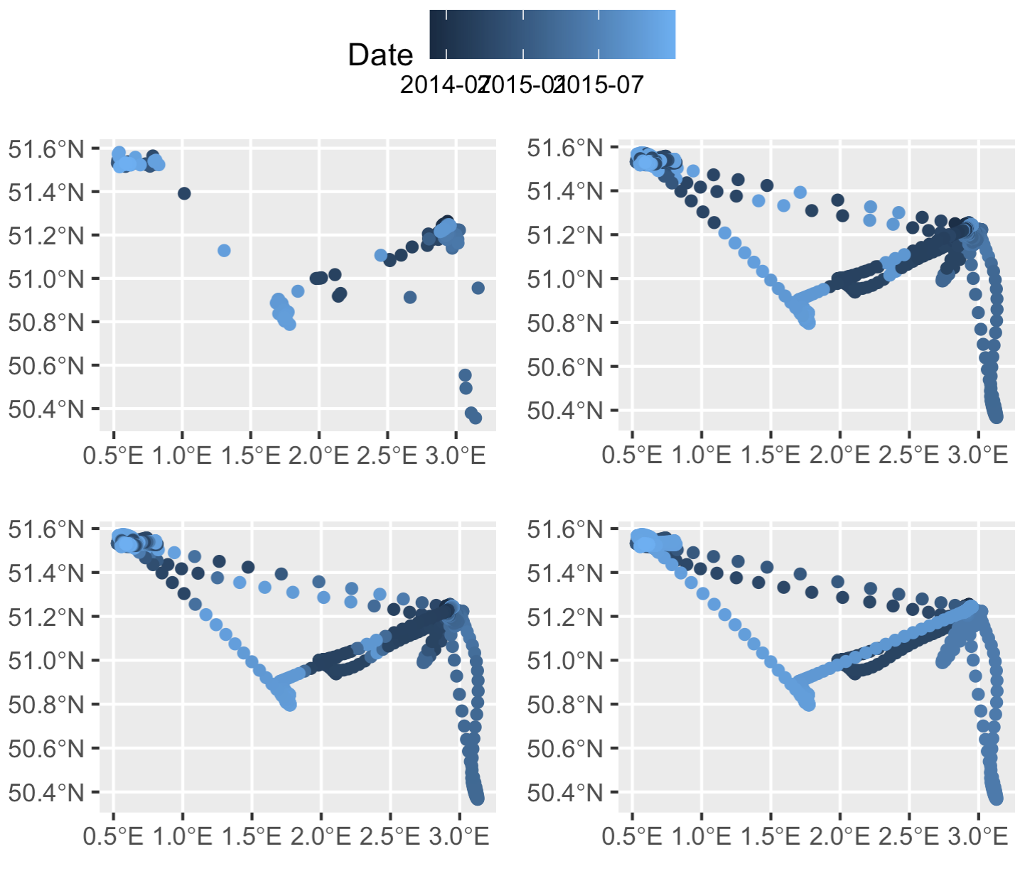
Top left: original thinned dataset, colored by timestamp (i.e., after step 2 of our process). Top right: the dataset after merging in the smoothed datapoints, but prior to rearranging any timestamps (after step 5). Bottom left: smoothed points after one round of rearranging timestamps (step 6, before the `while` loop). Bottom right: smoothed points with correctly rearranged timestamps (end of step 6, after the `while` loop finishes running).
Step 7: Clean up the output
At the time of this writing, converting an R data object to data.table removes the sf class. So let’s reset that.
out <- st_as_sf(out)
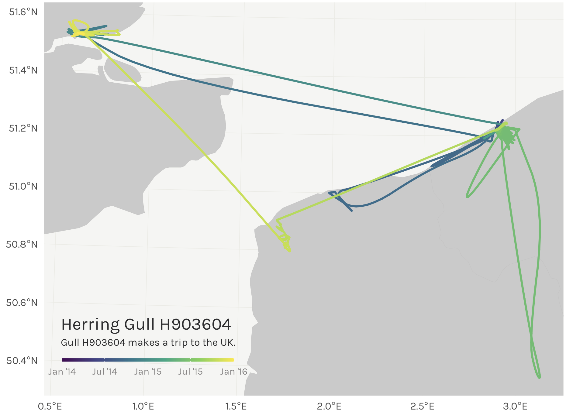
Step 8: Map it!
The final step is to plot it up all pretty. Here I’m just using land polygons from the rnaturalearth package.
# Download land data
world <- rnaturalearth::ne_countries(scale = 10, # high res, large scale
country = c("United Kingdom",
"Netherlands",
"Belgium",
"France"),
returnclass = "sf")
# Set the CRS
# Let's set the CRS to the local UTM zone so the tracks aren't
# distorted - UTM 31N
out <- st_transform(out, crs = 25831)
world <- st_transform(world, crs = 25831)
# Set the bounding box for the plot
bbox <- st_bbox(out)
# Extract lat & long for our plot
out$lat <- st_coordinates(out)[,2]
out$lon <- st_coordinates(out)[,1]
# Now plot it! We'll use viridis to color the line.
library(viridis)
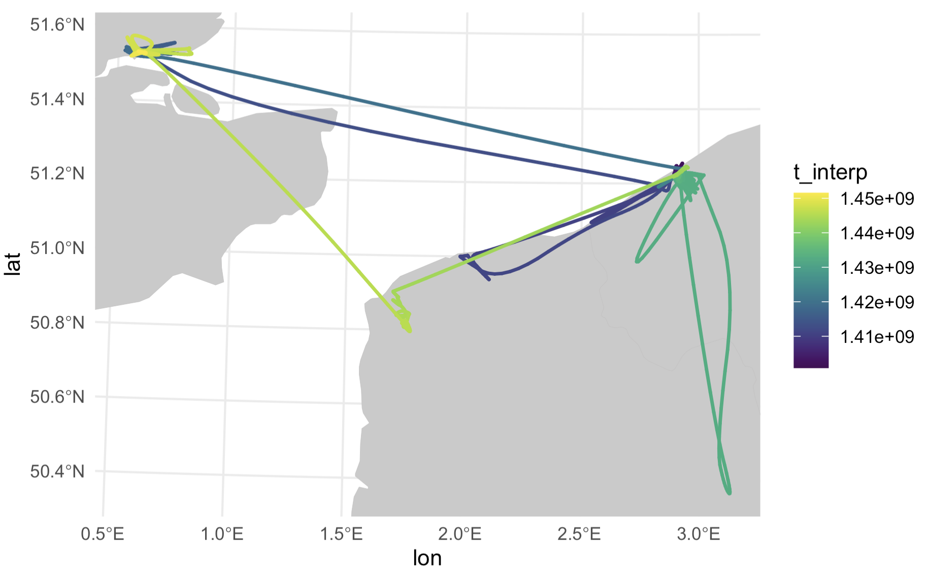
map <- ggplot() +
geom_sf(data = world,
lwd = 0.1,
color = "#C3C3C3",
fill = "#CBCACA") +
geom_path(data = out,
aes(x = lon,
y = lat,
color = t_interp),
size = 0.8,
lineend = "round") +
scale_color_viridis() +
coord_sf(xlim = bbox[c(1,3)],
ylim = bbox[c(2,4)],
expand = T) +
theme_minimal()
This could certainly look prettier, with a nicer scale bar. Let’s pull out pretty looking dates from the data and do some scalebar magic to change the labels to look nicer.
scale_dates <- pretty(out$t_interp)

map <- map +
  scale_color_viridis_c(breaks = as.numeric(scale_dates),
                        labels = format(scale_dates, format = "%b '%y"),
                        limits = c(min(as.numeric(scale_dates)), max(as.numeric(scale_dates))),
                        guide = guide_colorbar(direction = "horizontal",
                                               title.position  = "top",
                                               label.position = "bottom"))
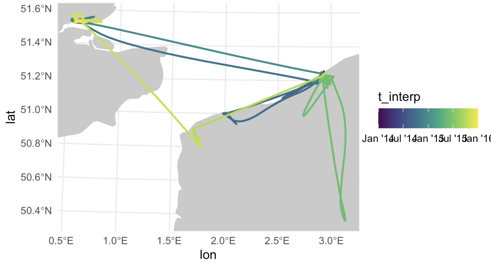
Much better labels on that scalebar now. Now all that’s needed is some tidying up. As a fair warning, this is the part that takes FOREVER and is typically what I spend the most time on.
map <- map + theme(text = element_text(family = "Karla", color = "#2D2D2E"), # change the font
            legend.position = c(0.2,0.08), # Move the legend to the bottom left corner
            legend.margin = margin(t = 0, unit = "cm"), # Set top of legend margin to zero
            legend.title = element_blank(), # Remove legend title
            legend.text = element_text(size = 8, color = "#878585"), # Adjust legend text size
            legend.key = elementalist::element_rect_round(radius = unit(0.5, "snpc")), # Make the scalebar have rounded edges (thanks to elementalist pkg)
            legend.key.width = unit(1, "cm"), # Change legend colorbar width
            legend.key.height = unit(0.1, "cm"), # Change legend colorbar height
            legend.background = element_blank(), # Remove legend background
            axis.title = element_blank(), # Remove axis titles
            panel.grid = element_line(color = "#ebebe5", size = 0.2), # Change lat/long graticule line colors
            panel.background = element_rect(fill = "#f5f5f2", color = NA)) # Change plot panel background color
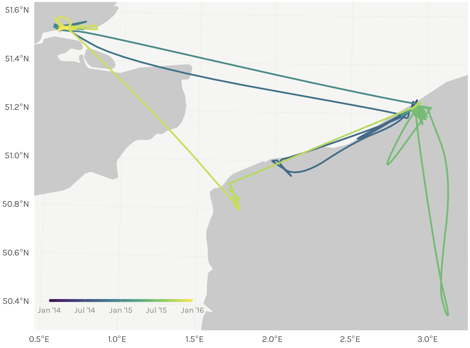
Maybe we can add a caption to top it all off…
map <- map +
  annotate(geom = "text",
           x = 330000,
           y = 5600000,
           label = "Herring Gull H903604",
           family = "Karla",
           color = "#2D2D2E",
           size = 5,
           hjust = 0) +
  annotate(geom = "text",
           x = 330000,
           y = 5593000,
           label = "Gull H903604 makes a trip to the UK.",
           family = "Karla",
           color = "#2D2D2E",
           size = 3,
           hjust = 0)
Step 9: Putting it all together
In one giant gist below.
Bonus step 9.5: Bundle your code into one handy function
I’ve already done this for you in my sRha package, which you can download and install from Gitlab:
devtools::install_gitlab("popovs/sRha")

sRha::gradientTrack(dat = tracks,
                    grp = animal_id,
                    lat = latitutde_col,
                    lon = longitude_col,
                    t = timestamp_col,
                    tz = 'UTC',
                    timegap = 'median',
                    crs = '25831')
..but here’s what it would all look like in one function ;) As an added bonus to this bonus, that function also includes code to split up large datasets into bite sized chunks to create the gradient tracks in my maps at the beginning of this post.
Now go forth and make some pretty maps! And please tag me on Twitter @srharacha if you do!
Resources
- I’ve bundled up this code into my own person R package for function snippets I frequently use. The
toLinestringandgradientTrackfunctions are both in thesRhapackage. - Beautiful and thematic maps with ggplot2 (only)
- Animals move in such elegant ways that other mapmakers have been using them as artistic inspiration for years. The book Where the Animals Go sits on my shelf and is a great inspiration.
-
NOTE: here we wrap
NAwithas.POSIXct()so that it matches the same data type as the ‘date’ column. Otherwise it fails to dump all the results of the if/else statements into one column in your dataframe. ↩︎